YOUR LIFEQ REPORT
This space will tell you everything you need to know to get the most out of your Report.
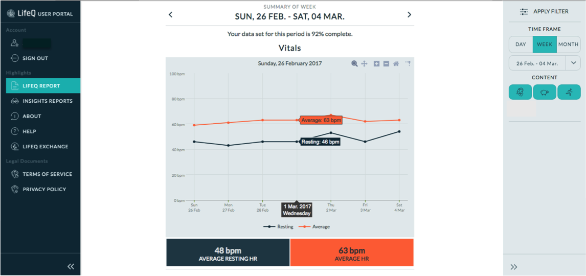
The LifeQ Report provides a detailed visualization of the data that has been collected using your LifeQ enabled vívosmart© HR.
Once you have collected and uploaded data via the LifeQ Exchange App, please navigate to your LifeQ Report in order to view your results.
In order to access your Report, please follow these steps:
- Login to the LifeQ User Portal at pilot.userportal.lifeq.com
- You will automatically be directed to your LifeQ Report
OR go directly to pilot.userportal.lifeq.com/report/body
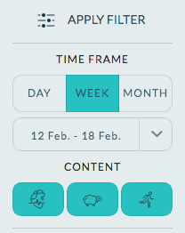
Filter your data
Once you have selected your data, easily navigate between dates/time frames using the left and right arrows in the Quick Date Navigation control, located at the top of the LifeQ report.

Your LifeQ enabled Garmin vívosmart HR records three aspects of your daily life. These include:
VITALS
The Vitals page provides information regarding the change in continuous heart rate (HR) over a given time range
Week & Month view
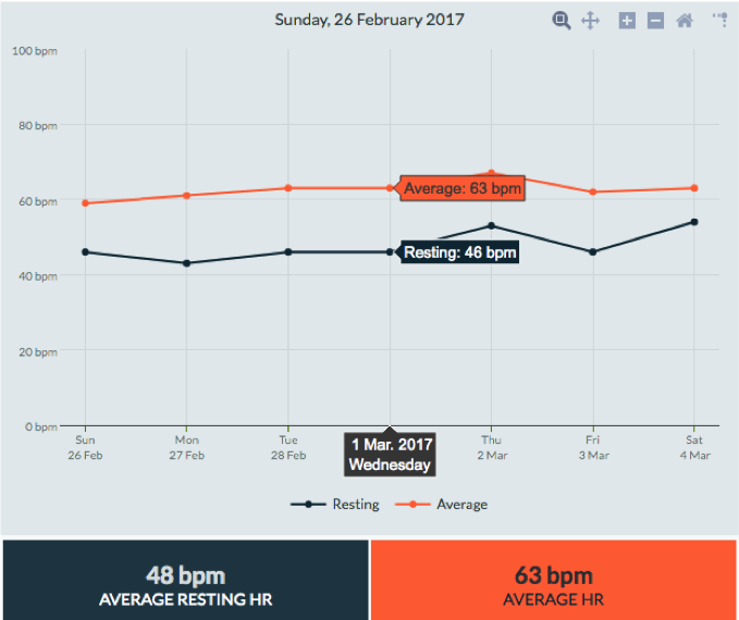
While in the Week and Month views, you are able to observe your average heart rate (HR) and average resting HR for each day of the selected time frame.
In order to see the value associated with a specific data point, hover over the chosen point. Alternatively, click on the graph whilst hovering over a specific day in order to navigate to the daily detail page.
Below the Vitals plot, you will find the total average resting HR and average HR for the selected period.
Day view
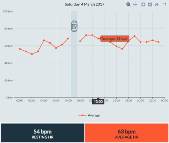
While viewing data in Day view, you are able to observe your average continuous HR per hour for a specified day.
The hourly average is calculated from the averaged heart rates recorded each hour (i.e heart rate measurements between 09:00 - 10:00 are averaged and displayed as the hourly average).
Please note: Your continuous, real-time heart rate is not displayed on the LifeQ Report. This means that you will, unfortunately, not be able to view the peak heart rate that you observed during an exercise session.
SLEEP
Sleep Quality combines objective sleep parameters to provide a measure of how well you have slept. The quality of sleep directly affects many aspects of an individual's life including mental sharpness, productivity, emotional and physical well being.
Week & Month view
View your summarized sleep results for each day of the selected period while in the Week and Month views.
The stacked bar charts represent the distribution of time spent in each of the sleep phases per night. Each colour represents a different phase of sleep. The axis on the left shows the sleep duration, while the axis on the right represents the sleep quality (also indicated by the line plotted through the graph).
To view the details for a particular day, hover over each bar. A summary of the sleep session will be presented. Alternatively, click on the graph for a particular day to open the daily detail page.
Below the Sleep plot, you will find a breakdown of the average time spent in each of the four sleep phases, as well as the average sleep quality and duration for the selected period.
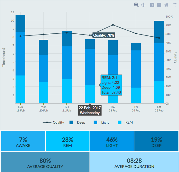
Please Note: As the majority of time spent asleep falls on the day that you wake up, your sleep is presented on this day.
For example, if you went to sleep on Saturday night, the sleep session will be shown on Sunday.
Day View
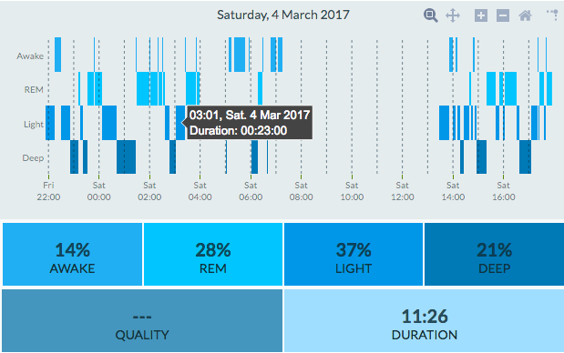
The hypnogram presented on the Day view provides a more detailed account of your transitions through the sleep phases. In this view, you can observe the duration of time that has been spent in each of the four phases.
Once again, hover over each data point to view the time and duration for each phase transition. Similarly to the Week View, the averages for time spent in each of the phases, as well as duration and quality will be shown below the hypnogram.
ACTIVITY
LifeQ’s Activity plot incorporates both Steps and Energy Expenditure (Calories)
Steps refers to the number of steps that you have walked.
Energy Expenditure refers to the amount of energy required to perform any physical functions (breathing, digestion, posture maintenance, or physical activity), and is measured in calories
Week & Month view
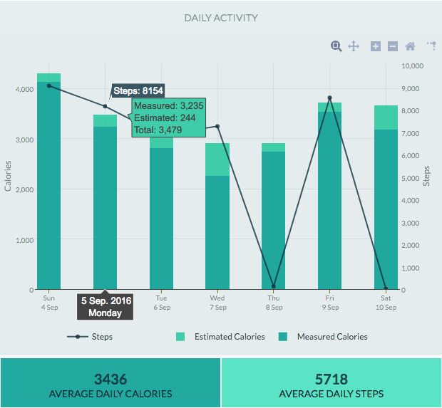
The total number of Calories burned per day are displayed as bar graphs, which are separated into two metrics; Measured and Estimated Calories. Measured Calories (dark green) indicate the total calories that have been calculated while wearing the device, while Estimated Calories (light green) indicate the calories that are expected to have been burnt while/if the device was not worn.
The total number of Steps walked each day are presented as the line graph overlaying Calories.
Hover over a selected data point to view its value. Clicking on a specific date will not direct you to the daily detail page.
Below the Activity plot, you will find the Average Daily Calories and Average Daily Steps for the selected period.
Day View
View your daily Calories and Steps for the selected day.
Please note: A daily view chart for activity is not available
